For those of you who know me, they will know that I am not the quilting police, nor am I a stickler for ‘following the rules’! In the years that I have been sewing, the only thing that I have become certain of is – it should be fun!! Sewing to me is what I call my ‘Third Space’, (‘First Space’ being family, ‘Second Space’ being work).
It is the time that I can disconnect with my every day demands and pressures and take some time for myself to enjoy doing something I love! (I know everyone can all relate to this!) For me, the excitement starts from the moment I find that fabric or pattern, which I simply can’t resist. So how do I choose that fabric which will then go on and be in my masterpiece?? In a few different ways, although the principals are relatively the same.
I can walk into a fabric store and there is that one piece of fabric which just screams ‘You want me – take me home!’ (I wish it was Scott Eastwood!) This is usually in my favourite colour and I am in love straight away. Sometimes I will have a plan with this fabric straight away, but for me I find this is not often, so home to my stash it goes. When I decide to use the fabric,
When fabrics are first printed, they come in a range with coordinating fabrics, which makes fabric selection extremely easy. Usually, there is a colour range, so you can choose in which ‘direction’ you want to go. As in this Tula Pink Eden Collection below
– if you are not a colour green lover, you could concentrate on the pink and purple range. This is the easiest way to purchase your fabric.
However, usually by the time that I want to use my beloved piece- the range is sold out or discontinued, so then I have to choose the coordinates myself. This can be where the real fun begins!
There is numerous books which you can purchase which go into great detail on choosing colours. Although I do find it can be very confusing, so I have broken it down into a few things that I take into consideration when purchasing coordinating fabrics: hue (or colour); scale of print; value of colour; and overall look
Hue – the colours need to blend and coordinate with your master fabric.
Scale of print – A print with a large scale print will be lost if cut into small pieces, so make sure the scale of the pattern is appropriate for the placement in the quilt.
Colour Value – also known as contrast. Make sure there is enough colour value to obtain the desired effect… it is no use having all your fabric with the same colour value as you will lose the pattern of you quilt.
Overall look of quilt – do I want it looking traditional, modern, fun, scrappy, feminine, masculine… etc. In a modern quilt, I might like to add a ‘pop’ of colour, where in a masculine quilt, I would be more sedate in my fabric choices.
All these factors will determine fabric choice.
Although sometimes, I will want to create a quilt and not know what colours I want to do it in… How do I choose then?? Recently my mother and I were fabric shopping for the same quilt.
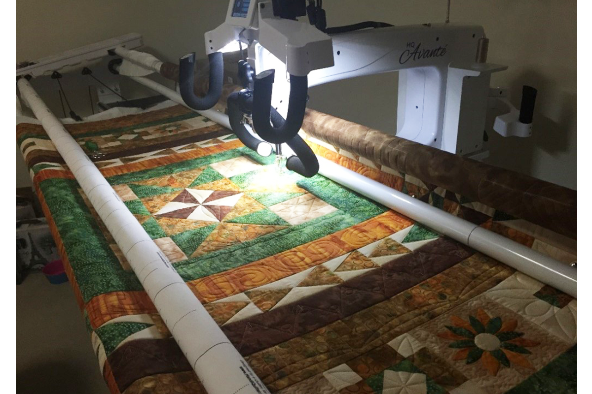
Boxing the Compass quilt pattern in which she was making it for my Uncle. The overall effect for Mum’s was for it to be masculine – of which we choose browns, fawns, oranges and greens.

I couldn’t choose, I didn’t have the fabric that ‘grabbed me’ (I couldn’t have my Scott Eastwood fabric), so off clothes shopping we went! In a local clothing store, I found a gorgeous dress, (which didn’t suit me at all) although I was taken with the colours! Back to the quilt store and ‘wallah’…my next quilt!


You can see by the two quilts how colour can completely change the ‘feel’ of a quilt. Although they are the same pattern, you can incorporate a theme or ‘personality’ into the quilt and the quilts can look completely different.
Another option which I am eager to try is using colour pallets that are already designed for you on the web. Pinterest has endless options of pallets and hues that are just gorgeous and the options are endless! (oh I am getting itchy fingers looking at all these scrumptious colours….when can I start another??)
The three examples below are from design-seeds.com


So – have I ever made a ‘colour mistake’? Absolutely!! Isn’t that how we all learn! I recently made an Australiana Quilt for an overseas colleague of my husbands, which I strongly disliked. So many people saw the quilt in a different way to me, and absolutely love it!
Moral to the story – we are all individuals, whose tastes are different and unique! I do not believe there is ‘right and wrong’ – more a ‘better and best’! At the end of the day – it is your quilt that you need to be comfortable with making. You will know for certain when you are happy with your colour selection and that is when the fun begins!
Happy Sewing
Debbie